Introduction

My name is Thakshana Yogeswaran and I am a media student at The Latymer School. My candidate number is 9179.

I am working in Group 3 with Gift Emesi (9044), Angela Chen (9025) and Monica Aghadiuno (9365)

In order to view my work please click on the 3 labels on the right named A2 Research and Planning, A2 Construction and A2 evaluation.

Group 3 - Music Video

Inside Panels

Inside Panels
Our Digipack, top left - back, top right - front, bottom left - inside panel, bottom right - inside panel (CD)
This is a link to our website, click the image above to enter our site

Monday 21 December 2015

Construction Post 6: Website Post-Production

We used a software called Wix to edit our website.

We felt that is software was relatively easy to use and all the features were easily accessible and this software really helped us create our desired website.


My Main Contributions:
  • I made the structure of the website initially, showcasing where everything would go and matching it as much as I could to the flatplan
  • I changed the layout of the meet the girls page to make it more interactive and more professional looking. 
  • I also contributed to help make the other pages. 

Initially, we started by working out a rough structure to the website and using the flat plan that we made to structure everything and then we added images.

This was what we started with and although we did like it we knew that we had a lot more work to do in order to make it look professional.

We wanted our brand to be synergistic across website, digipak and also other social media pages so we stuck to our colour scheme of red, white and black throughout.

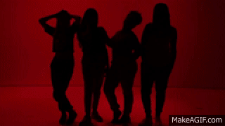
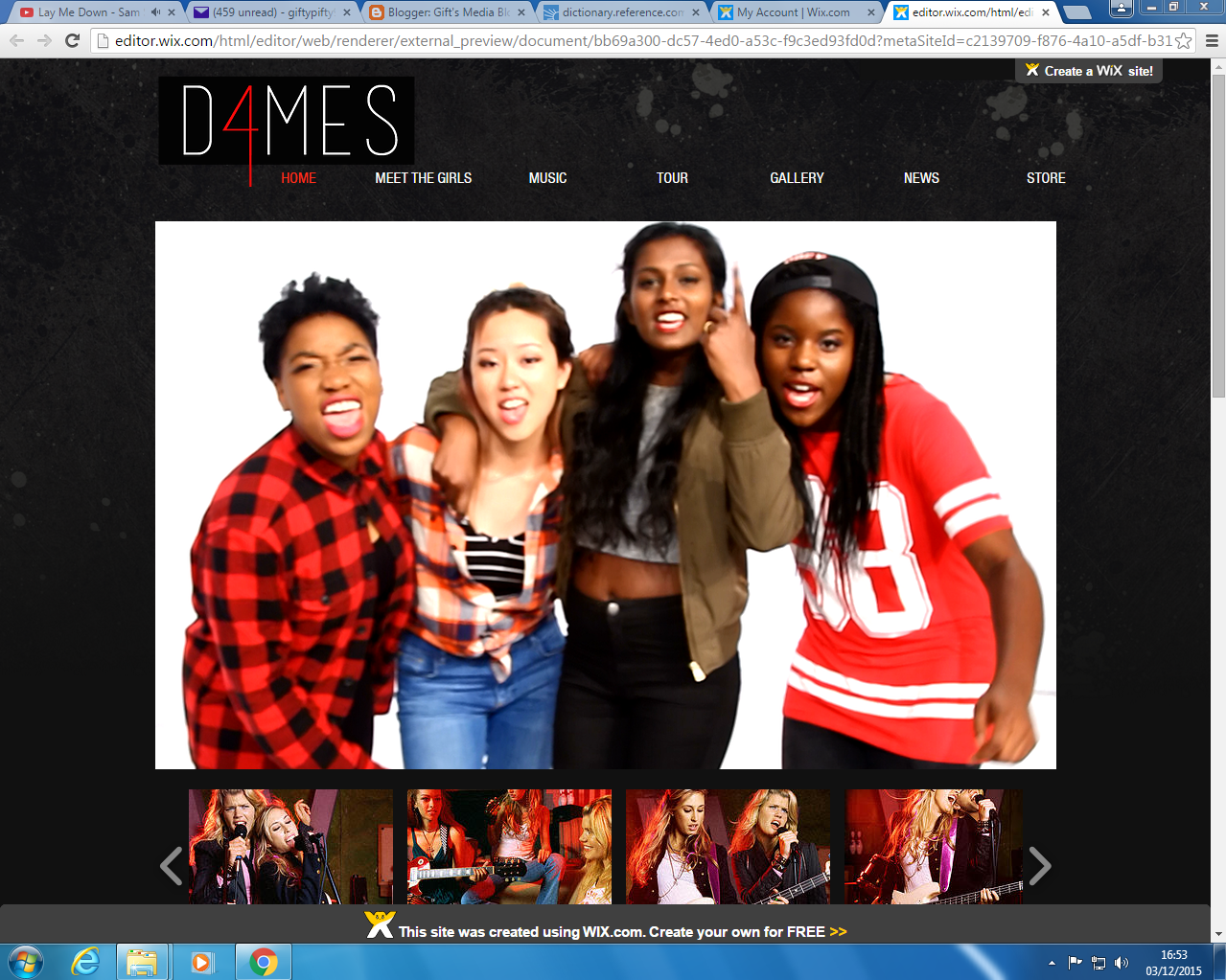
It is conventional for artist websites to have the navigation bar at the top with their name/logo highlighted with a big picture of themselves on the home page, so we have adhered to this convention.


We then decided to have an 'Enter Site' page like many other artists such as One Direction because it allows us to promote our music video and album straight away. 


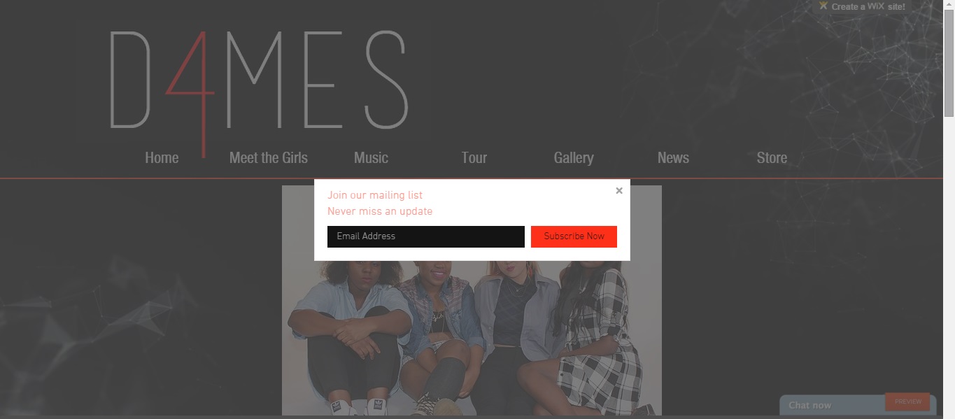
Also, just to add a bit more interactivity to our website, once you click on the 'Enter Site' button, it redirects you to our home page but a message also pops up offering the audience to subscribe to us for daily updates etc. 


After this, we decided to revamp our homepage as we liked the layout but we weren't happy with the sizing of things, the pictures we initially used and also we lacked a bit of interactivity

The changes we made are:

  • We made the logo a lot bigger
  • Added a subscribe button for interactivity
  • Changed the pictures so that now they look more professional and represents us a band better
  • The big picture now changes as well, it scrolls by itself as the user in on the page
  • We added a bold red line under the whole header.

We then got to work on all the other pages.

Initially, the meet the girls page was just one page split into four sections with a little section for each of us.


We changed that so now when you click on the meet the girls page it shows individual pictures of us and then when you click on the picture, it takes you to a different page with information about that specific girl.


I really personally love the gallery page as it is really conventional but still looks really professional. On the right is the actual gallery where you can click to enlarge each image and then on the left is a live instagram feed where the audience can see our instagram updates live from the website and also an easy way for them to follow us as well.


The Store page definitely took the most amount of time and effort as we had to create each piece of merchandise individually and then add it to our site.

We used the website shown below to create all of our merchandise:


This website was very useful as it gave multiple different angles to view our products and for clothing items, it even showed us pictures of models modelling our clothes. It was also easily customisable, allowing us to change the colour of the products, resize the logo etc.

This is an example of all the different angles the website allowed us to have of our product
This is how we resized and cropped our logo
This is the colour choosing option, a variety of colours were provided
This is a picture showing the model modelling our merchandise which makes it more appealing to the audience. 
Another convention of artists' website that we followed was having all the social media links at the bottom of every page with the copyright of the record label. The audience can click straight from the website onto the social media pages which makes it synergistic. There's also a contact us option so they can ask questions or anything straight to us.


Construction Post 5: Digipak Post-Production

The software that we used to edit the digipak panels on was Adobe Photoshop - a software we had used previously but it also required us to go away and research how to do certain things in order to edit our images to a professional standard.


We had already drawn up a rough flat plan of how we wanted our digipak to look so this was our point of reference whilst editing. However, there were certain stages where we couldn't follow the flat plan exactly and so had to make executive decisions about key things.


Template


We started off with the template which was colour coded:

- Green: the main space of the digipak where all images/texts should be placed
- Blue: the area that allows for a bit of spillover but there is a chance that it may get cut off during.printing
- Red: the bleed area - nothing should be there as it will get cut off during printing


To begin with, we had the tough decision of going through all our promotional stills and choosing the pictures that we thought best reflected the band and would suit our album. This took quite a while and we still got it wrong and changed it multiple times throughout the editing process. For example, at the early stages the picture we chose to use as our main, focal picture on the front our album cover was:

But this is the actual, final picture that we ended up using, after much deliberation as we felt this picture looks more professional and represents the band in a better light.
    Angela and I using the spot healing tool to edit Monica's picture. 
  • After choosing the picture, we then had to edit the picture to make it look more professional using things like the 'skin smoothing' process in Photoshop. This process involved using tools such as the clone stamp and spot healing tools to edit the pictures. This process was long and lengthy and required a lot of patience. 


  • We then had to remove the white background of the pictures using the quick select tool and also the refine edge tool. On the left is a picture of me using these tools to remove the background off of one of our shots.
    This was the first edited version of our digipak. However, after feedback and discussing it with each other, we were not happy with the outcome. So, we decided to go back to the beginning and re-think what we were going to do. We decided that we needed to change the focal picture on the front and also the background, and so we did this.


  • Here is a video showing two members of my group using the refine edge tool and then going back over the edges to fix them:
  • Once we had made those changes we ended up with this:

We were happy with the way this version looked but we were not sure about the positioning or the font of the 'D4MES' logo. We therefore sought audience and teacher feedback on what we should do. Both parties advised us to get rid of the 'stamp' effect on the logo as they said it looked 'tacky and didn't do the album cover any justice'. So, we got rid of it and ended up with a front and back cover that we all really liked and thought worked well for the band:


  • Once we were happy with the front and back of the digipak, we had to focus on the inside cover. We started off by choosing a black background as we thought the contrast with the white on the outside would look good. However, after audience feedback, many said that the black background made the digipak 'look mismatched'. So we had to change this.


  • We tried to play around with certain effects to make it look like we were almost embedded into the digipak but in a variety of different colours. However, we did not like this fit in with our band image or identity and again made the digipak look even more mismatched so we started again.


  • When we went back to the drawing board, we realised that it was probably better to keep the background across all four panels the same in order to create that sense of everything working together. We did this and we also liked the way it looked. Instead of embedding the image onto a multi-coloured backdrop we decided to embed it into the white and grey one to keep the monochrome theme running throughout. We also decided to add all of the band members name so that it didn't look empty on the inside. 


I was very pleased with the final outcome of our digipak. It was very time-consuming and required a lot of replanning and rethinking our ideas but in the end, I feel like it all came together really well and we worked really well as a group to create a professional looking, promotional digipak for our band. 

Construction Post 4: Music Video Post-Production

The editing software that we used during the music video post-production is Adobe Premiere Pro - a software that we had previous knowledge in from using it to a basic level at AS Level. We developed our skills in the use of this software throughout the course of this project.

The picture on the right shows our editing suite that we used throughout the making of our music video:


My Individual Contributions:

  • I helped cut together the whole video include chorus shots and also my own individual section
  • I helped grade and colour-correct the video
  • I helped research striking effects and recreate them in our own music video.

The Process:
  • Firstly, we cut the basic sequence of the music video using the timeline as shown below:
Above is the music video timeline where we cut together all our shots using the razor tool. We worked in multiple video layers in order to choose the best take of each shot and it also made it easier to sync up the visuals to the audio. This process was simple as we knew what to do but at the same time it was still time-consuming because we had the pressure of choosing the best shots and arranging it in the best order. 

  • After the timeline of all the shots were arranged, we moved onto focusing on grading our shots in order to make them look a bit more professional and cinematic by using a tool called ProcAmp.
ProCamp allowed us to adjust things like the brightness, contrast and saturation of certain shots. There was also the Three-Way Colour Corrector where you could balance colours out. For example, if the shot looked a bit blue-ish or cold, it allowed us to add a warm tone to contrast this colour and balance it out. This was also an easy yet time-consuming process.


Above is a video showing the grading process of the video and also the difference it made to the shots. 


We also used the ProcAmp tool to add flashes to certain shots in order to add more excitement to the shots. We achieved this by putting the contrast down and the brightness up.


  •  After all the grading was done and all the flashes added in, we moved onto focusing on adding striking visual effects in the post-production stage in order to grab the audiences attention and maintain it throughout the video. 
We used the motion tool in order to change the positioning of the shots in order to create a cool layered effect. We copied the shot onto multiple video tracks and changed each positioning slightly to achieve this effect.  

The horizontal flip tool was used to create a distorted effect and was also used to quicken the pace of the music video. 


We wanted to add more adventurous effects than what any of us knew how to do so we went onto YouTube and researched some effects that we could possibly recreate in our own music video. We came across the 'ghost effect' which we all really liked and I recreated this in our own video:


After Feedback:

After our first initial edit was fully complete, we asked our media teachers for some feedback on what they thought of the whole video. They were really impressed with it but one of their criticisms was that maybe during the chorus, instead of just having the dance sequence, they suggested that we intercut between some other shots in order to create variation and keep the video flowing nicely.

After listening to this we altered our chorus shots to include a larger variety of shots, an example of which I have shown below:


Construction Post 3: Photo Shoot for Promotional Shots

This week it was time to take the pictures for our promo shots (pictures to put on the digipak, website and social media pages). We had to book specific slots when the space was free to use and when we're all available.

The days and times we booked are:

  • Tuesday: 7am - 12pm
  • Wednesday: 9am - 11am
  • Thursday: 4pm - 8pm 

Initially, we underestimated just how much time it takes to set up lighting, make sure they all work and also how long it'll take all four of us to actually do our make up and get ready. However, the first shoot day was okay as there were no major problems faced during the shoot.

Here is a picture of Gift helping to do Monica's hair. We all helped each other as we took a bit too long to get ready and were running behind schedule. 

On the left is a picture of Gift and I practising our poses before the shoot and to the right is a picture of one of the lights we used. This light would flash as the person operating the camera took the picture. 


We thought the first day of shooting went well but after reviewing our photos, we weren't that happy with them. Some of them were blurry and not lit properly and in most of them at least one of us wasn't ready for the picture so we knew we had to use our backup shoot on Thursday.

Here are some examples of the bad shots:


On Wednesday we had a chance to take some of our individual shots.


We were quite happy with the outcome of our individual shots. When we sat down and reviewed them we all found a couple that we really liked that we could use for our promotional purposes. I have shown some of these images in this blog.


This picture showcases one of the make up looks that I did for this shoot. Bold, statement eyeliner and red lips is quite a trendy make up look and I thought it would match the description of our band.


Thursday was supposed to be our back up shoot if we needed it and since we decided we wanted to redo our group shots, we all agreed to use this shoot to get better pictures. However, things didn't really go according to plan at all. The lights that were supposed to provide our flashes for the images didn't work for almost two hours of our planned four hour shoot. However, Emma was really helpful through this stressful situation as she figured out a way to fix it so that it was working again. This now meant that we had less than two hours to shoot all of our group shots, since we also had to leave time at the end to pack everything away. However, with that being said, I think we managed pretty well and in the end came out with some really nice pictures that we were all happy with.


Here I have included a selection of the best photos from the second group shoot.